
Kyle Staver

Kyle Staver, Lion's Mouth, 2025. Oil on linen. 68 x 56 in, 172.7 x 142.2 cm. Image courtesy the artist and Nino Mier Gallery. Photography by JSP Art Photography.
It’s not an overstatement to describe the past season as a celebration of inventive painters who are women. There were noteworthy shows by male artists, as well, but those by women far outnumbered them, starting with “Susannah Phillips: New Paintings” at Bookstein Projects, on the Upper East Side. Phillips offered a variety of mostly intimate views of the studio with a few larger works. The geometry of an easel, shelves, windows, doorways, and leaning canvases became potent, loosely indicated suggestions of a painter’s workspace— images that casually emphasized geometry and threatened to turn into abstractions, if we looked away. One almost black-and-white, modestly sized, horizontal canvas was so explosive that it was legible as an interior only because it was surrounded by works with more specific allusions. Phillips keeps the planes of her nominal subject matter parallel to the surface of the canvas, provoking memories of classical friezes that enrich the quotidian basis of her images.
Most of the studio paintings were crepuscular gatherings of not-quite grays, brown-taupes, and off-whites that evoked walking into a dimly lit room; at times, we were momentarily disoriented, as we would be in the real experience, but we regained our balance because of the sturdy verticals and horizontals of the easel and the emphatic rectangle of a window. Other paintings, boldly slashed with warm ocher or orange, were sunlit or had the lights turned on. The view of the studio was similar but slightly different in each canvas, so that the series was both eye-testing—have I seen this before?—and rewarding, as broadly indicated planes conspired to be read as workspace furnishings and then made us consider them as inventive, non-referential structures. One can only applaud Phillips’ audacity in taking on a time-honored theme and turning it into something completely personal, not only updating a conventional motif, but also making it fresh and compelling—and a little mysterious.
At Miles McEnery Gallery, in Chelsea, Lisa Corinne Davis displayed her usual virtuosity in juggling layers of sharp-edged floating shapes—mostly small rectangles—keeping them aloft by means of intense, often strongly contrasting color. In Convulsive Calculation, 2025, a flurry of blue and white squares blew against a mouth-puckering green-yellow expanse, anchored at intervals by larger dark green-black rectangles that reiterated the shape and proportion of the canvas. Shifts in the sizes of the hovering squares suggested both mobility and ample space. In other works, the size changes in the rectangles were so dramatic that their clusters read as vortices retreating from us. No matter how they were deployed, alterations in the size and density of the crisp squares and rectangles with which Davis carpets her paintings made each work read differently, with the variations enhanced by her various ways of treating the perimeter. Her recent paintings were constructed out of a visual vocabulary that she has taught us, over the years, to identify with her, but each canvas was surprising and unpredictable.
The multiple, repetitive elements with which Davis constructed her recent paintings were often larger than in the past, which made the paintings more confrontational. In earlier works, we often felt that we were at a great distance, as if we were flying or dealing with a system of mapping. Recent works, such as the pulsing yellow-green-orange Illusive Location, 2025, never distanced us but, instead, presented themselves forceably for our attention, making us consider layering, interval, and rhythm in new ways. In a couple of canvases, elongated shapes, like chopped bars, argued with the squares, further enlivening the space, especially in Fleeting Form, 2025, which explored the permutations of saturated pink with a surprisingly minimal use of the color, set off by bursts of green, orange, maroon, chalky gray-blue, and white. In most of the exhibited works, while we were engaged by the complex “micro” relationships among the welter of airborne colored rectangles, a sense of all-overness, of a continuous fabric of overlapping repeated elements, demanded to be acknowledged. That’s a new kind of space for Davis. Something to do with her expansive mosaic mural at the subway station at 68th Street and Lexington Avenue? Perhaps.
Also in Chelsea, at Thomas Erben Gallery, Harriet Korman showed “Housing Development: New Paintings and Drawings,” a group of vibrant canvases and oil stick drawings unified by their exploration of the possibilities of nested rectangles. Korman says she thought about traditional, expedient representations of a house as a square surmounted by a triangle. “I knew I didn’t want to do that,” she says. Her recent paintings could be described as about “house-ness,” with the rectangles stimulating our sense of being within a foursquare enclosure or confronting a structure based on vertical and horizontal relationships. Despite the reliance on what appears to be straightforward geometry, Korman’s nested rectangles and their defining boundaries are handmade, without the use of a straight-edge, just as her compositions, symmetrical or not, are made without measurement, so subtle deviations from true and fair animate the works.
It was illuminating to see a wall of urgent, relatively casual oil pastels testing what seemed to be the infinite variables of Korman’s basic composition and to compare them to related paintings. The works on paper are not studies but have a character of their own. The canvases are more precise, with cleaner edges and uninflected expanses; they are equally lively but in a different way. The full-throttle color of the paintings—a seemingly endless range of intense yellows, greens, reds—both reinforces their forthright geometry and disrupts it, just as the slightly wonky “drawing” does. Spend some time with a painting that seems symmetrical and balanced or a group made with repetitions of a particular color, and we discover that things are a little off, not quite what we expected, just as we find that each iteration of green—say—is different. Korman captures us, at first encounter, with the deceptive simplicity of her images, then compels us to look harder. When we do, we discover nuances and shifts we hadn’t registered at first. Nothing is quite what it seems. As we have come to expect of Korman, she gave us a lot to look at and to think about in “Housing Development.”
Farther downtown, at the Soho branch of Nino Mier Gallery, Liliane Tomasko showed “Poem Things,” recent large paintings and a few smaller works, provoked by a poem by Rainer Maria Rilke. All of the canvases were constructed with broadly brushed, ample, personable shapes, at once gestures and presences, that simultaneously declared their presence as paint on a surface, suggested idiosyncratic forms, and jostled one another in fictive space. The range of shapes and gestures competing for space suggested barely contained energy, heightened by Tomasko’s subtle palette of neutrals punctuated with often generous intense notes of reds, oranges, and the occasional saturated blue. The disjunctive diptych format of several paintings intensified this sense of potential movement; in the diptychs, the disparate sides, while obviously conceived separately, somehow convinced us that they made sense together without obvious repetitions or cognates, partly because of their similar but varied curvilinear internal rhythms, like a continuo holding a Baroque concerto together.
“Poem Things,” we were told, refers to the German tradition of poetry that animates ordinary objects, such as Rilke’s evocative “Evening,” which was included in the press release. Tomasko subtitled the paintings with phrases from the poem; a diptych with an assertive dark disc on one side and a more casually brushed, pale rose one on the other, was titled Poem Thing: “Slowly the evening puts on the garments held for it by a rim of ancient trees.” Tomasko invites viewers to bring their own baggage to these muscular paintings, but also to take her association with the poet’s phrases about gathering darkness into consideration, in nonliteral ways. Interestingly, Tomasko’s palette was not particularly “evening-like,” while, if anything, it evoked the man-made rather than the world of nature—at least for this viewer. The large works, with their assured presence, dominated the show, but a few smaller paintings with aggressively textured surfaces and a series of tiny, intimate oil pastels, rewarded persevering to the back room.
In Tribeca, at Canada, “Katherine Bradford: Communal Table” offered the most recent version of her alternative universe of just plain gorgeous color, plainspoken forms, forthright brushmarks, and an irreverent spirit, at once seductive and with an edge. Bradford’s world seems to be equally about lived experience, observation, and the fact of paint on a surface. Overscaled figure shapes enacted domestic dramas. Blazing color suggested summer heat or dazzling sun, while luminous blacks and deep blues conjured up nighttime. But just as we began to think about what was happening in the picture, we found our attention completely captured by the abstract structure of brushy planes.
In Communal Table, 2025, economically presented seated figures, arms extended across the tabletop, were all but engulfed by a broad patchwork of superheated ochers, oranges, and icy blue. A metaphor for the uniting power of a shared meal? Something particular seems to be going on, as it does in all of Bradford’s work, but we read specific references into her images at our peril. Her way of working involves a kind of visual free association, not rigid preconception. A suggested image provokes a response, not necessarily a rational one, in terms of narrative. We are forced to rely on our own associations, to make up our own stories to justify what the disparate crowd of figures is doing, scattered above an oversized reclining person barely contained by the bottom of the radiant, deep blue, nocturnal While Father Sleeps, 2025; in the end, I suspect, we may be most engaged by the ravishing orchestration of dull pink-reds against the expanse of inflected ultramarine, and the differences among the summarily indicated figures. But that tension between an implied, perhaps complex subtext and just plain wonderful picture-making and paint-handling is part of what holds our attention. Witness the alluring Moonlight, 2025, with its two figures, one perhaps knee deep in water, one full length and fully clad, perhaps on shore, under a generous sprinkling of confetti-like stars and a not-quite round moon. Inexplicable? No matter. The fact of paint, the richness of color, and the improvisatory quality of the drawing are more than enough. The associations Bradford triggers are a bonus.
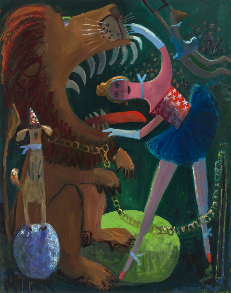
Farther south Broadway, at Nino Mier’s Tribeca space, “Kyle Staver: the Greatest Show on Earth” surrounded us with antic images of performing lions with sharp teeth and lolling tongues, their open mouths framing the heads and limbs of their tutu-clad trainers; a booted and spurred Annie Oakley galloping past a herd of spotted steers; eager dogs; improbably agile equestriennes; and a troop of trained zebras, among other tongue in cheek, virtuoso renderings of vernacular entertainment. (Well, not all vernacular; there was a crowd of ballerinas performing Swan Lake, with black swans interspersed among the white-clad dancers.) The generous figures and animals, completely convincing, but pared down to their essential characteristics, threatened to burst out of their assigned spaces, their expressive postures intensified by Staver’s saturated color and surfaces that read as both smooth and substantial.
Staver’s paintings are at once fiercely serious in their aesthetic ambitions, elegantly painted, and witty. Throughout “The Greatest Show on Earth,” stars, stripes, and American flags appear on costumes and as décor, sometimes where you least expect it, defusing associations with current demands for announcements of patriotism and turning the motifs into just another explosive, cheerful circus element. The sharp-toothed, snub-nosed lions, too, are at once threatening and benign, ferocious and charming—a multiple reading that informs the entire exhibition. We are enchanted by Staver’s playfulness and the humor, but our attention is compelled and held by the inventive compositions, delightful characterizations, and alluring color.
The large paintings were punctuated by some of the small reliefs that Staver makes as the paintings evolve, not as preparatory studies, but as explorations of light and, sometimes, of possible alternatives. (Her paintings often have complex evolutionary histories.) Previously, she has shown white, unpainted reliefs; these were polychromed. I’m not entirely certain, but I think I prefer the white versions, which seem to marry Staver’s rowdy imagery with echoes of a classical tradition. The colored versions belong more to the (admittedly distinguished) history of porcelain figurines. The lions, at any scale, in any material, were entrancing.
It wasn’t an entirely female season. Farther down Broadway, Shrine Gallery showed recent, challenging, disconcerting work by an accomplished male artist, “Clintel Steed: Different Time Zones, Different Dimensions.” The paintings were dazzlingly constructed, their multiple, fractured planes and robust paint-handling all contributing to a sense of inevitability and surprise, as well as creating dense, firmly structured, claustrophobic spaces and the unexpected personages that inhabit them. The images were, to say the least, unpredictable and demanded close scrutiny: astronauts in space suits, Olympian gods, pre-Columbian characters, personified animals, and more, and that’s not to mention the inclusion of a fantastic “alien invasion-type” spaceship and a Mycenaean mask from the 16th century B.C. Steed is riffing, we learn, on the difference between an imagined not-so-distant future completely mediated by technology and an idyllic natural world. Technology was clearly the enemy. Nothing good seemed to be happening in the astronauts’ crowded, packed spaces—apart from the sheer accomplishment of the painting as painting. Was cannibalism taking place in Dante’s Inferno in Space, 2025? The lush Celestial Beings from Another Time, 2025, was more welcoming, with its vaguely Meso-American characters and superb beasts—a snarling tiger, a benevolent horse, and a fabulous vulture, with outspread wings, against dense foliage. Another standout was Neptune and Hera Embrace, 2025, a smallish, close-up double “portrait” contrasting a shaggy blue sea god with a suave, luminous green Olympian goddess. (I wondered whether the combination of Latin and Greek names for the respective deities was intended to reinforce the difference in conceptions.) Steed’s recent paintings are exciting and puzzling. I was knocked out by the brilliance of even the ones I didn’t like—if that makes any sense.
Sangram Majumdar’s “The Sleep of Reason,” at Nathalie Karg Gallery, on the Lower East Side, assembled some of his most recent and strongest works to date. Majumdar has often pulsed between ambiguous abstractions and allusions to the figure, usually in fairly separate bodies of work. His recent paintings combined the two approaches in expressive ways, with imagery that occasionally hinted at his own history with brown-skinned bodies that could be seen as Indian. (Born in Kolkata, Majumdar was educated in the U.S. and lives here.) It was impossible to decide whether the exhibition name echoed Francisco Goya’s title for his nightmare images or referred to our troubled present. The mood of the paintings seemed to shift. Majumdar’s recent work is sensuously colored and constructed with rhythmic shapes, yet we are kept slightly off-balance. Figures, now explicit, now covert, sometimes fragmented, emerged from bold, emphatic planes, with complex, cursive patterning sometimes linking the two. Tiger paws loomed in one urgently layered painting. We found more and more truncated figures in the large Control, 2025, the longer we spent with the painting, discovering tumbling, minimally indicated bodies, some presented as stripped-down shapes, others conjured up with loose drawing. Stylized eyes and portions of faces flickered through smaller paintings, forcing complex, disorienting spatial readings.
However we chose to connect with these unstable, dreamlike images, we were first attracted and then held by Majumdar’s full-bore, jewel-like color—deep blues, played against purples and acid yellows, sometimes off-set with abundant white, and occasional notes of sugary pink. Smaller works on canvas and paper at times offered variants on the larger images, an approach Majumdar has long pursued, sometimes photographing a painting in progress before continuing to work on it and then taking the captured image in a different direction, while the flavor of the first version never entirely disappears. That may account for the strong family resemblance among some of the exhibition’s strongest works, despite their individuality and self-sufficiency—yet another layer of complexity in these resonant, intricate paintings.
Back uptown, in Chelsea, Lisson Gallery presented “Sean Scully: Tower,” a group of large and small paintings made in 2025 and three chunky sculptures built of colored stone blocks, from 2023. The smaller paintings, in the gallery’s front space, were mostly descendants of the “Wall of Light” theme that Scully has found fruitful for years. In these energetically brushed fabrics of rectangles of different proportions and orientations, their component, slightly wobbly-edged shapes seemed to have been fitted together almost against their will, animating the deadpan, irregular expanses of blocks. The works in the first gallery were painted on copper, a sleek material, more commonly associated with Netherlandish painters of the seventeenth century. Scully clearly likes the way oil paint can be moved on the metal surface, while preserving evidence of the hand manipulating the brush; the minute escapes of warm copper, visible in places between abutting rectangles, help to enliven and warm the paintings. The sturdy, just below waist-high sculptures, with cubes of contrasting color and texture set within cubes, rang changes on the geometric structure Scully has made his own. In one, a cube of pale cream stone, framed by dark and light gray bands, surrounded an insertion of delicate pink. It looked almost edible.
The large “Tower” paintings, in the next gallery, were constructed of varied rectangles, set in different orientations, with stripes in different directions, occasionally with projections. Scully sees these lively, disjunctive, somewhat disquieting, constructed paintings, with their rough-hewn surfaces, as metaphors for the disturbing world we are inhabiting. It’s certainly possible to read the Towers that way—especially when we know that they have their origins in a work made to commemorate 9/11. But it’s impossible not to be fully engaged by the Towers’ robust material opulence and the rich, unpredictable orchestration of their shapes and colors. Maybe things aren’t as bad as we think.
